We may think we exercise free choice when we are making decisions. But as my colleague Eric Johnson points out, the structure of our choice architecture actually has a huge influence on the eventual outcome. It isn’t surprising, therefore, that some e-commerce retailers tilt the odds in their own favor.
Choice architecture – the designs that influence how we choose
My colleague, Eric Johnson, has written a terrific book called The Elements of Choice in which he points out that “choice architects” have a huge impact on the decisions that are eventually made. By understanding and influencing the path people go through to come to an eventual decision, choice architects have an outsized impact on the outcomes we experience.
Unlike the utility-maximizing agents beloved by economic theories, behavioral scientists have long pointed out that people aren’t particularly rational when it comes to decision-making. You can create an entire career in the behavioral sciences by identifying and getting known for the discovery of a particular bias! For a great list of all the ways our brains depart from the rational, check out this extensive list.

Heuristics and the creation of a plausible path
Groundbreaking work on how decisions are actually made happened at places like Carnegie Mellon and Stanford. The big insight was that people use “simplified rules of thumb, or heuristics” to make decisions. In Eric’s words, “The classic demonstration involved people making inconsistent choices, caused by things that should not matter.” But, instead of the usual framing of the problem as imperfect humans making silly choices, he’s taken a different tack. What if we recognized the existence of these biases and designed choice architectures to help us achieve better outcomes?
As an example, consider a busy doctor’s office, a patient’s budget, and what kind of medicine a patient gets prescribed. A brand-name drug, such as the antihistamine Allegra, can cost five times more than its generic equivalent, fexofenadine hydrochloride. This is a big deal for patient health – when a drug is more expensive, patients sometimes skip doses or otherwise fail to adhere to their treatment regimens, damaging their overall health. Hospitals, recognizing this, have tried every mechanism under the sun to get doctors to prescribe appropriate generics. Seminars, emails, pop-ups on the electronic health record (EHR) device (that are so annoying, doctors turn them off, defeating the purpose). Everybody’s frustrated, and the brand-name drugs continue to be dispensed.
Researchers at the Weill Cornell Medical College made a discovery that cracked the problem. To enter a drug into the EHR, the doctor must remember its name. It turns out that doctors have a much easier time remembering “Allegra” than “fexofenadine hydrochloride.” This is reinforced by heavy-duty advertising and promotion by the manufacturers of brand-name drugs. Samples, free pens and other swag keep that brand name top-of-mind. The fix, architected by the Weill Cornell team, was to change the interface so that when a doctor started typing the brand-name into the system, it would immediately offer the generic substitute as a choice.
Now, the doctor could override the system’s suggestion and ask for the brand name drug to be dispensed. Here’s the interesting thing – they seldom did. This more than doubled the proportion of prescriptions for generics, producing big savings for the hospitals and for patients, and better health outcomes.
This is an example of influencing the ‘plausible path’ someone takes when they decide. We are all sensitive to how much effort we have to put into getting to closure on a decision. In the case of the doctors, making the generic choice the easy one and the brand name choice the one that required more effort (in this case, a simple extra mouse click) resulted in a massive behavioral change with system-wide benefits.
Understanding how to reduce friction as we make choices can be very big business. Google, for example, pays Apple big bucks to be pre-installed on new iPhones. One recent report said that this totaled $20 Billion in 2022. This is somewhere between 14 to 21 percent of Apple’s profits, for virtually no investment on Apple’s part. This is astonishing when you consider that switching to an alternative search engine probably requires no more than a few clicks.
Dark patterns
This brings me to what Harry Brignall has called “dark patterns” in web design. A dark pattern in web design represents a choice architecture deliberately created to force users to select options that they didn’t mean to, or which are not in their best interests. His web site features a “hall of shame” in which web sites that deploy such tactics are called out.
Colin Gray, a human-computer interaction researcher at Purdue University, has identified five basic types of dark patterns. These will be familiar!
- Nagging: This is the interruption of an activity with an unrelated request. Example: the Enable notifications suggestion only with OK and Not now
- Obstruction: This involves putting obstacles in the way of your getting to the result you want. Example: Hiding the “X” to close an unwanted pop up in a light shade that is hard to see.
- Sneaking: concealing, masking, or delaying the disclosure of information that might influence your final decision. Example: Hiding extra costs in the fine print at checkout.
- Interface interference: Deliberately confusing the user by putting some actions above others. Example: Amazon’s brand takeover ads, in which a search for say, “Kitchen-Aid Mixer” serves up an ad for a competitor, the Instant Pot Mixer.
- Forced action: Allowing you to access a function or a resource only in exchange for you performing a certain action. Examples: requiring you to create an account to proceed to checkout, or forcing you to download an update.
Dark patterns are particularly pernicious when it comes to matters such as our privacy, digital subscriptions and other activities that require effort to get to the result we want. In fact, service providers are so notorious for making it difficult to cancel, that the experience became the subject of a hilarious Saturday Night Live sketch.
Dark patterns as a service???
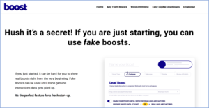
Piotr ?lusarski, a UX designer and critic of the widespread use of dark patterns, found that there are commercial companies offering us dark patterns as a service! Boostplugin.com brazenly offers completely fake “social proof” for those “just starting out” who don’t have enough real boosts to share – “Eva from Gotenberg just bought this!”.
Here’s a screen shot:
A 2019 Princeton University study called out 22 companies for providing dark patterns as a service, with several doing so quite brazenly.
Leveling the playing field – toward regulation of dark patterns?
Dark patterns on the Internet are a form of bad behavior that didn’t exist before, and regulators are always slow to react to novel elements of that kind.
But, in 2018, the Norwegian Consumer Council (Forbrukerrådet) wrote a report, Deceived by Design, offering copious examples of how the leading Internet platforms took advantage of dark patterns to essentially trick consumers into offering up far more data than they might have with a different design. By 2022, the topic was taken up by the OECD who began having serious discussions about how to legally define dark-pattern marketing (as opposed to more benign messaging) and to establish what consumer harm might be caused.
In the United States, the Federal Trade Commission released a report showing how prevalent dark patterns are and what the Commission is thinking about in terms of regulating them. It has begun to sue companies for “requiring users to navigate a maze of screens in order to cancel recurring subscriptions, sneaking unwanted products into consumers’ online shopping carts without their knowledge, and experimenting with deceptive marketing designs.”
Recently, the European Commission analyzed 399 on-line shops and found dark pattern deception on 148 of them – nearly 40% of all the sites they sampled. Its regulatory arms are girding for battle as well.
And some of the regulations are starting to show effect – just last December, the Federal Trade Commission fined Epic Games $245 million. The FTC’s lawsuit found that the company duped players into buying digital products via the game they did not intend to buy. Further, the company also allowed young users to make purchases with a single click, no password, ID or other check required. These were purchases that later went against their horrified parents’ credit cards!
Or perhaps the UX designers might realize the long-term cost of dark patterns
Michael Craig, a UX designer with TopTal, suggests that while in the short term, dark patterns are seductive, in the long term they serve to erode customer trust. His advice to his fellow designers is to try to talk clients out of using such tricks because in the long run customers will become disillusioned. He offers a very cool infographic on the most common dark patterns and what designers should do instead.
Regulation, better UX design and greater customer awareness – potentially all antidotes to the manipulation of choice architecture we find in the world of dark patterns.